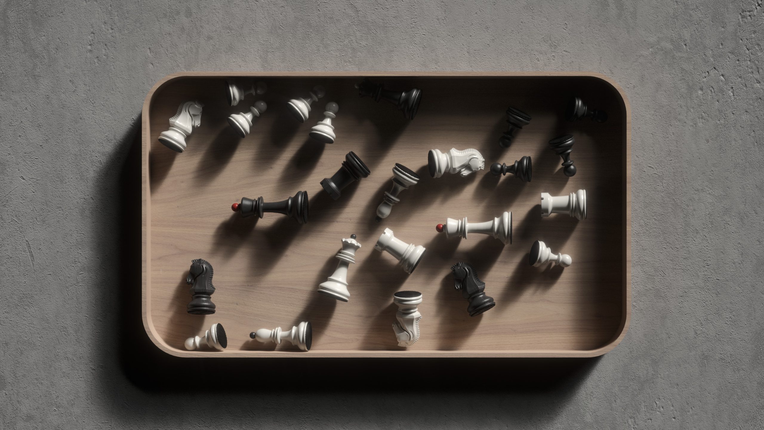
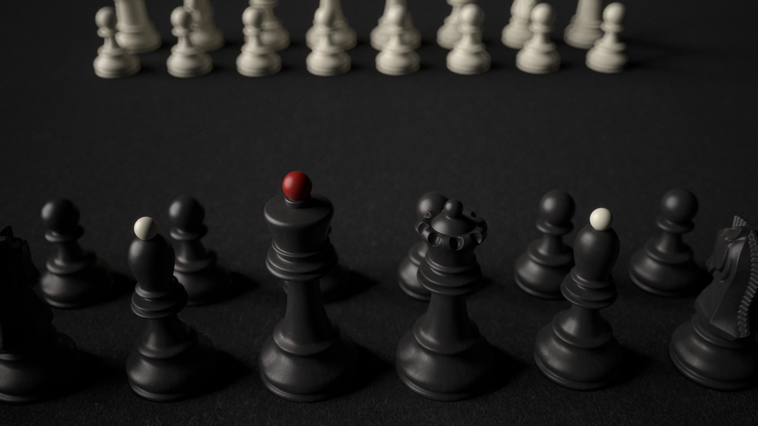
A chess set shaped by restraint, clarity – and one decisive exception.
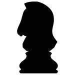
Designing a chess set means making decisions about form that are not just aesthetic, but deeply structural. Each piece is defined by its role, its relative hierarchy, and its position in a tightly balanced system. Yet within this logic lies a tension: the need to express difference without breaking cohesion. Nowhere is this tension more present than in the knight.
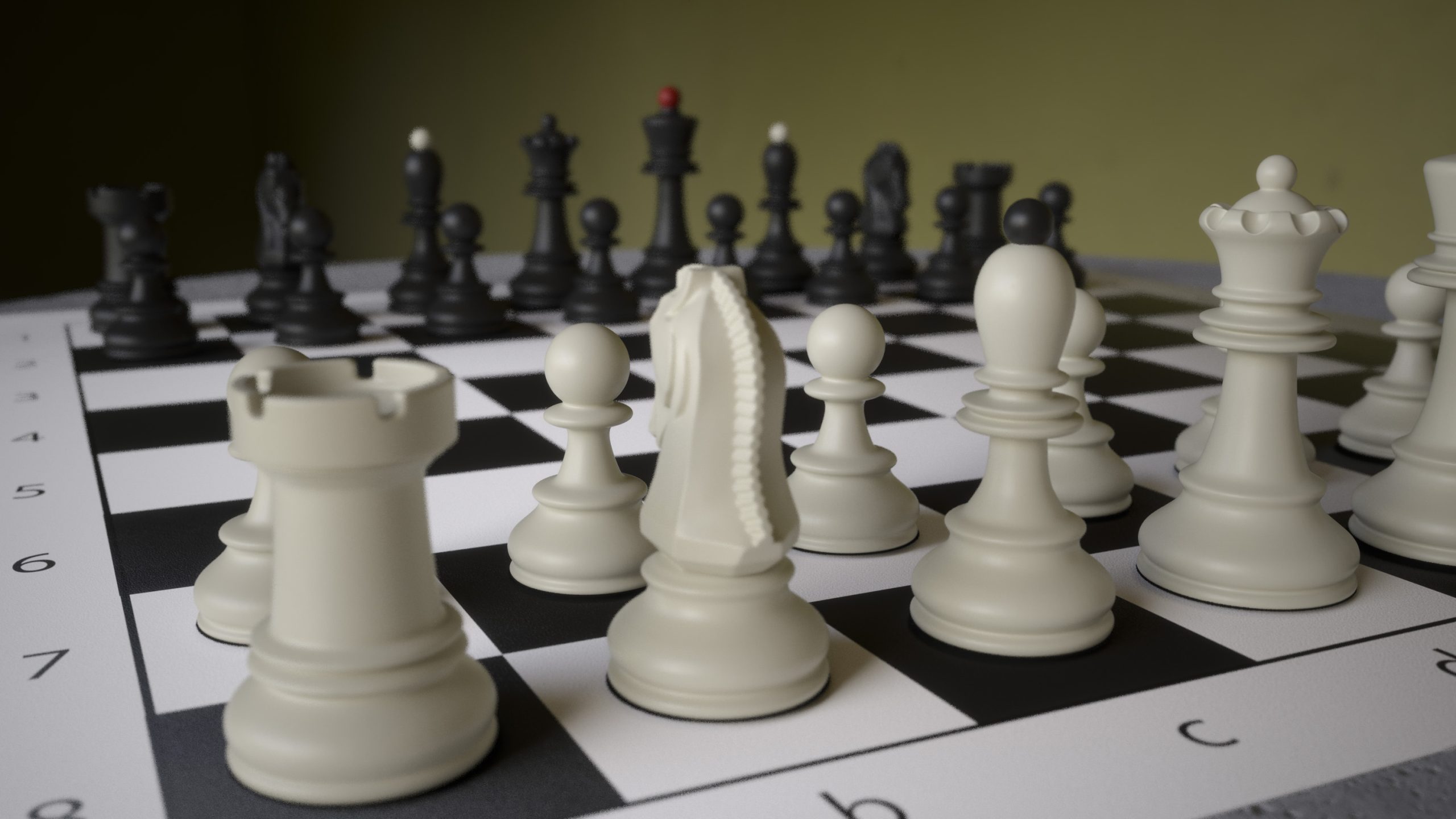
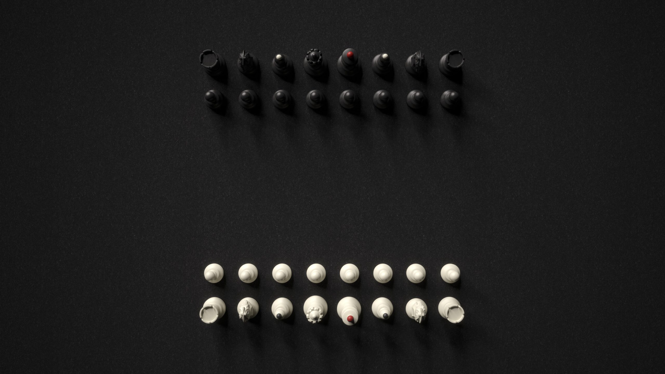
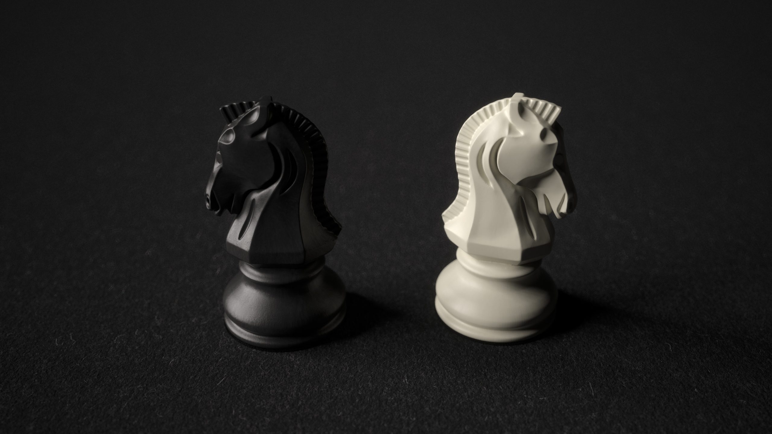
The knight is the only representational figure – a horse’s head in a sea of abstraction. It must stand apart, and still belong. It must convey something more, without saying too much. This project began with that dilemma, and in many ways, it was shaped by it. The result is a set born from restraint: clear in silhouette, modest in gesture, and unified in its vocabulary.
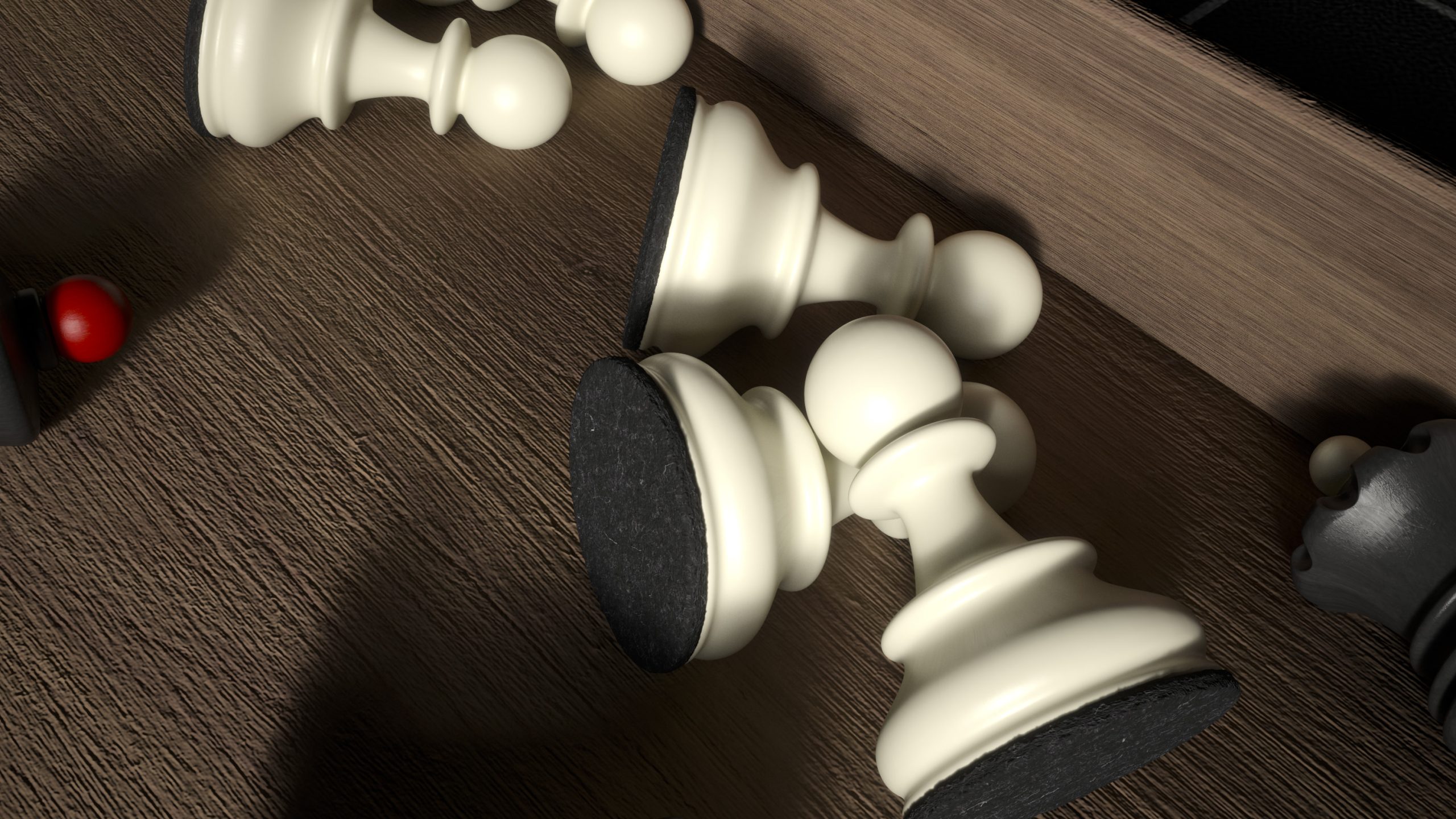
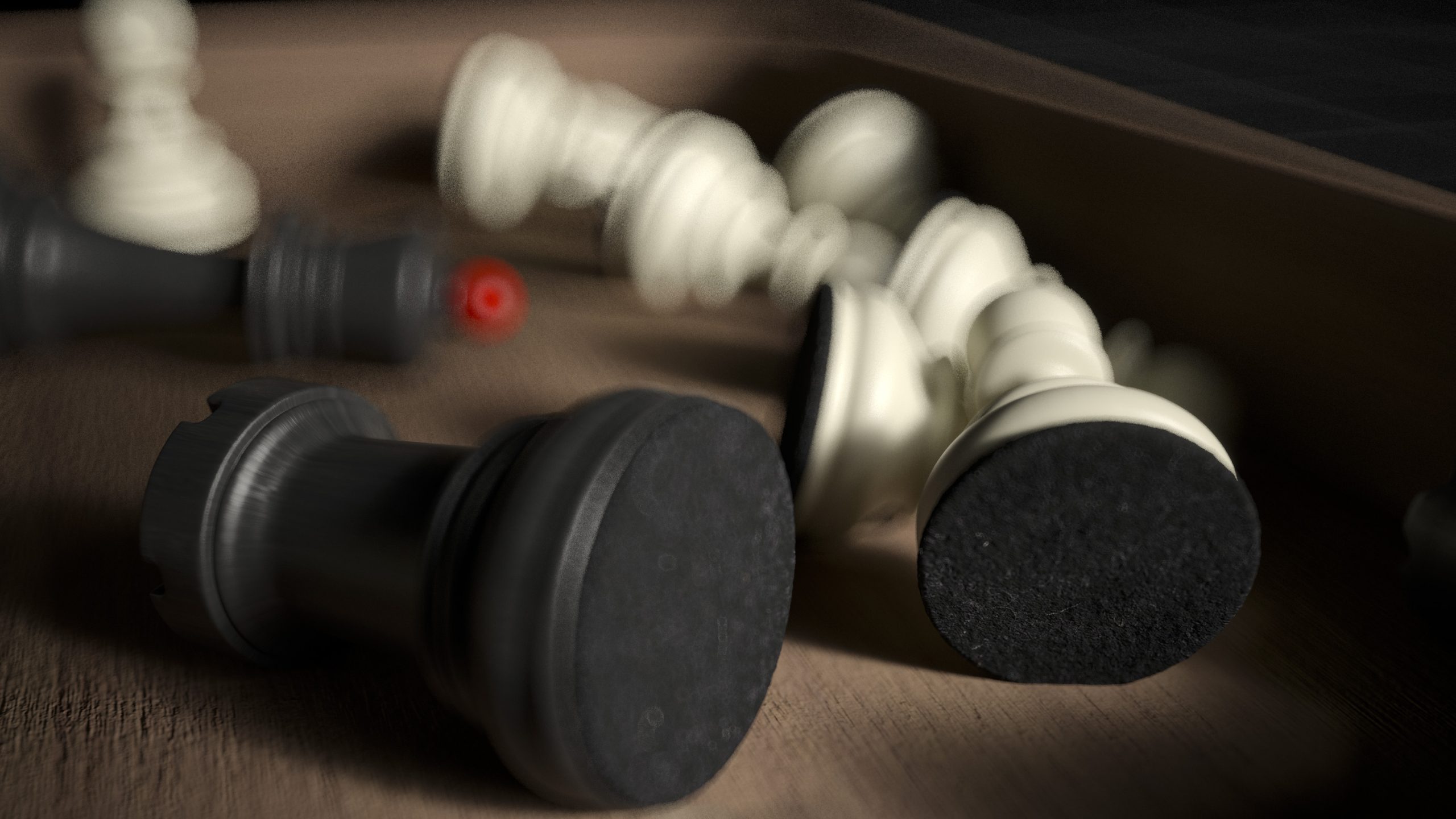
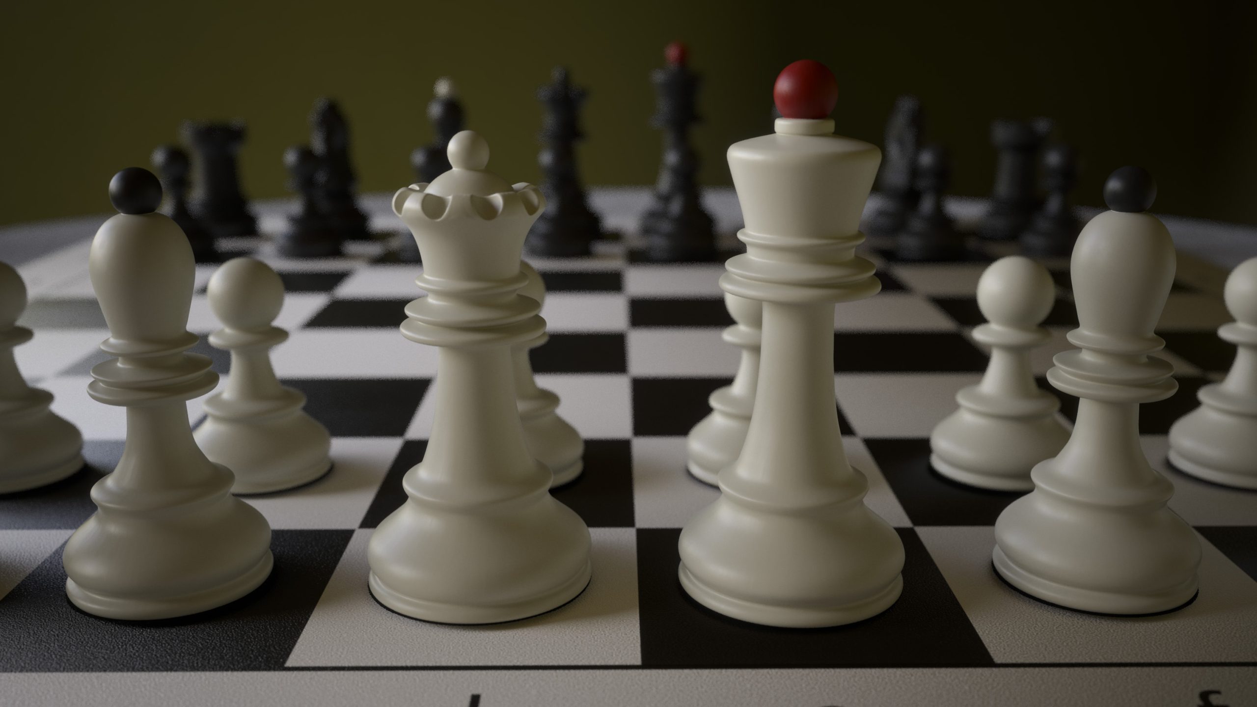
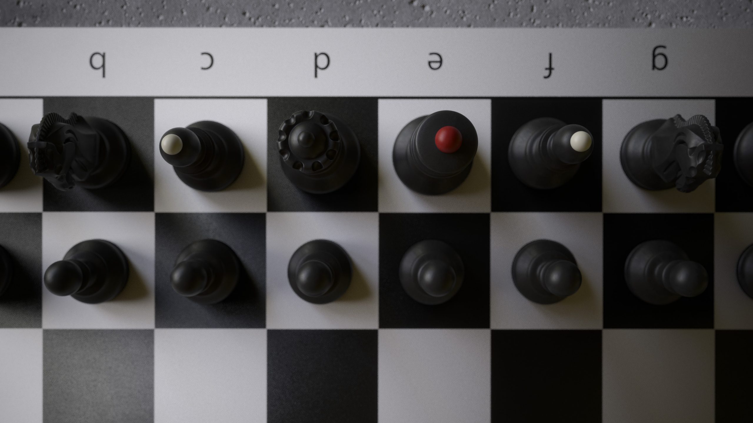
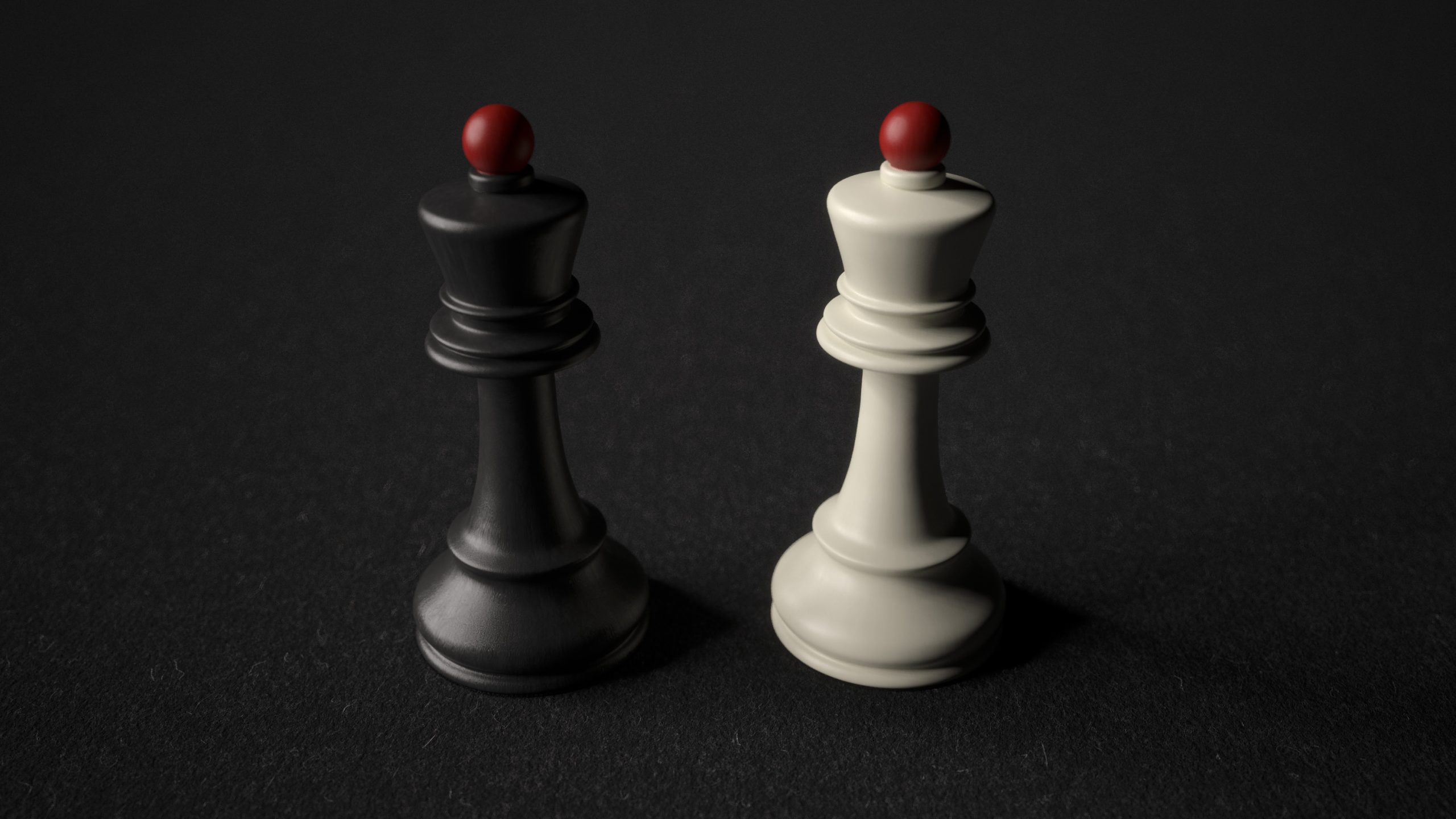
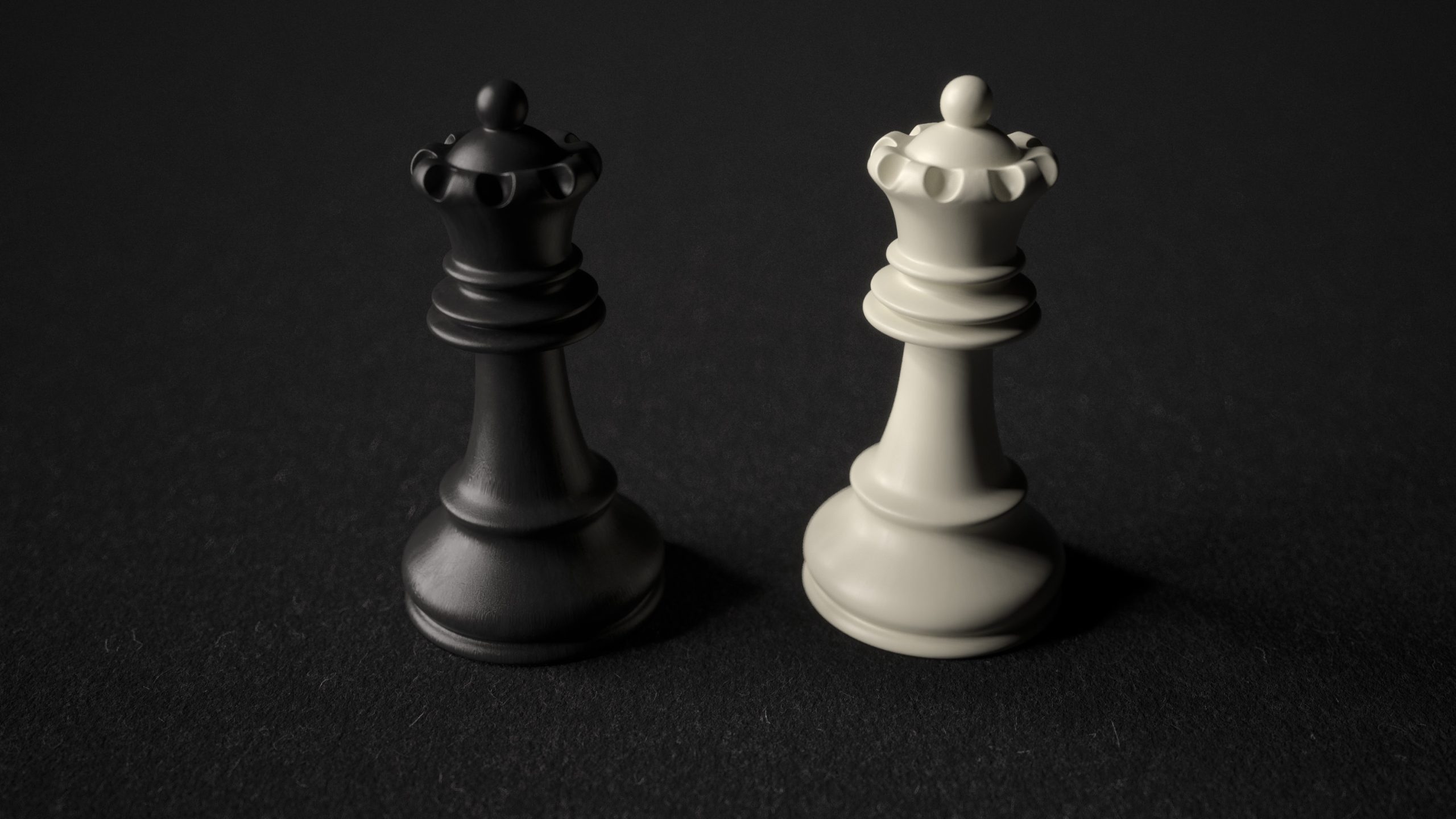
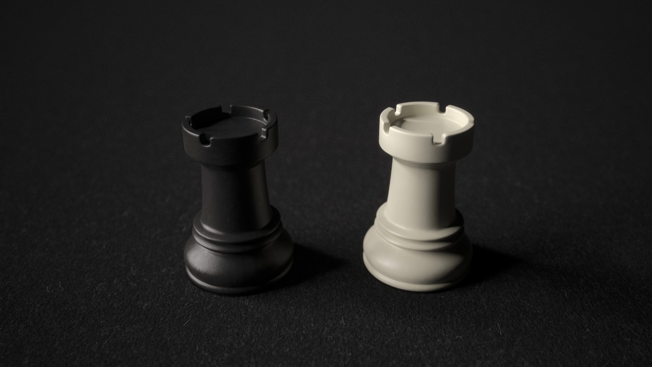
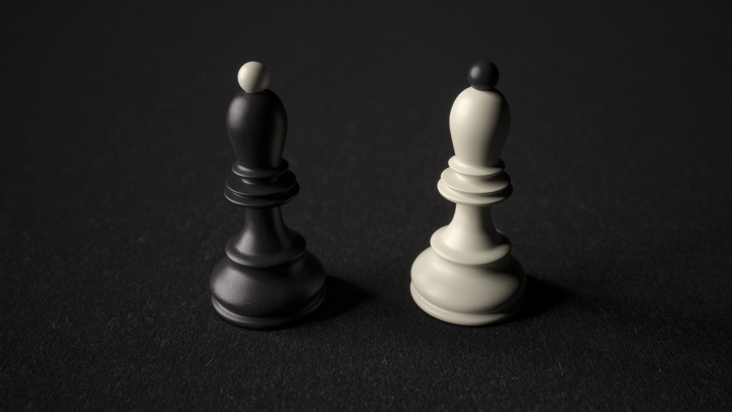
The forms are reduced to essentials: bases that taper gently, masses that hold their ground, transitions that avoid ornament yet offer rhythm. The king is tall, the pawn humble, the rook grounded. Each figure is made to be read – not admired from a pedestal, but understood in play.
The knight, in this context, becomes the pivot point. It tells a story, but in the same language. Its neck bends in tension, not theatrics. Its muzzle is quiet, not snarling. No exaggerated mane, no heroic posture. It is not a logo, not a mascot – but a figure of character, built from the same grammar as the rest. It asserts itself through understatement.
The entire set lives in this balance: between identity and integration, statement and silence. In searching for form, I chose simplicity over spectacle, clarity over decoration. And in that process – this Ringen um Form – I found a knight that does not seek attention, but holds it.